
ClearNet VPN: Designing for Trust Before the First Connection

The Problem
Most VPN apps have a trust problem before users even sign up. Server lists with no guidance, pricing hidden behind account creation, free trials buried in annual plan fine print — it's a category where confusion is the norm.
For users trying to access geo-restricted content, the stakes feel personal. They just want to watch their show. Instead they're decoding tech jargon and wondering if they're about to get charged. ClearNet VPN is a design concept built around one question: what does VPN onboarding look like when transparency is the product?
Generative Research: Finding Out Instead of Supposing
I recruited 5 participants through a pre-screened Typeform survey with branching logic, targeting streamers, students, and expats who regularly access geo-restricted content. I focused the research on a primary persona — Alex, 28, a drama enthusiast streaming Thai and Korean content from the US — to keep the design decisions grounded in one clear user need.
The interviews covered how people discover VPNs, what makes them hesitate, how they interpret pricing, and what actually builds trust. I also reviewed how competitors like NordVPN and ExpressVPN handle these same moments.
Three quotes framed everything that followed:
"I never know if I'm getting charged right away."
"There's a list of servers... but I don't know which one works best."
"YouTube influencers are the only ones I actually trust."
That last one surprised me most. Users weren't looking to the product itself for trust signals — they were going around it entirely, relying on external voices because the apps themselves felt opaque. That told me the trust problem wasn't just UI. It was the whole product relationship.
Usability Testing
After building a mid-fidelity Figma prototype, I ran 5 moderated 1:1 sessions over Zoom using a think-aloud protocol. Participants included international students and casual streamers with varying VPN familiarity — recruited from Asian drama fan communities and streaming subreddits, which directly matched my target user.
Each session covered three scenario-based tasks: setting up the app to stream Thai content via WeTV, reviewing subscription options and trial terms, and comparing ClearNet to a competitor. Sessions were screen-recorded with consent.
Design Pivot
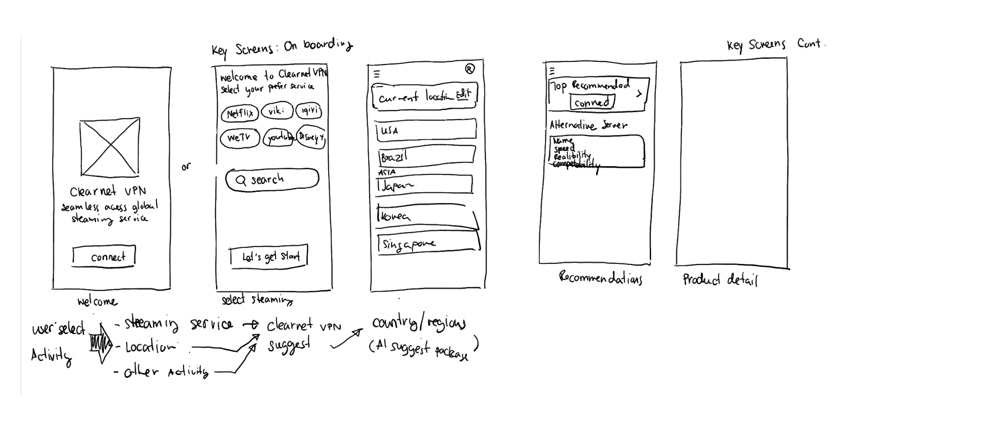
My original flow asked users to select their preferred streaming platforms first — Netflix, WeTV, Viki — before choosing a server. It seemed logical. But users don't think that way. They think: "I want to watch this show — where should I connect?"
So I flipped the model entirely. Instead of platform-first, I went location-first: users pick a region, and ClearNet surfaces which platforms work there automatically. This cut a major decision point out of the onboarding flow and made the app feel smarter from the start.
One small copy change came out of this too — I replaced "No credit card required" with "No charges today. Cancel anytime." The first is a marketing phrase people don't trust anymore. The second is specific, accurate, and aligns with how App Store subscriptions actually work.
Design Iterations
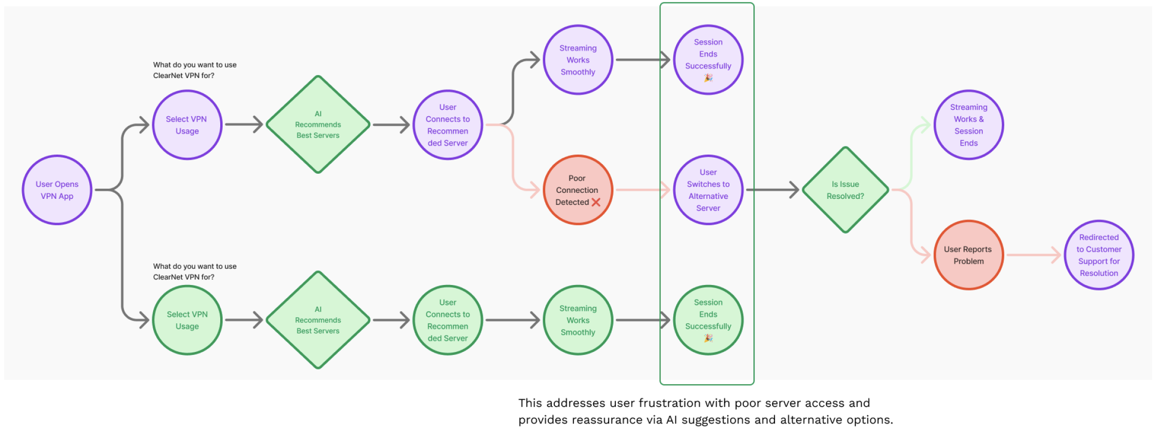
The location-first model gave power users like Alex full control — with a "Pick for me" fallback for anyone who didn't want to choose.
01 — Connection Modes: Clarity over jargon
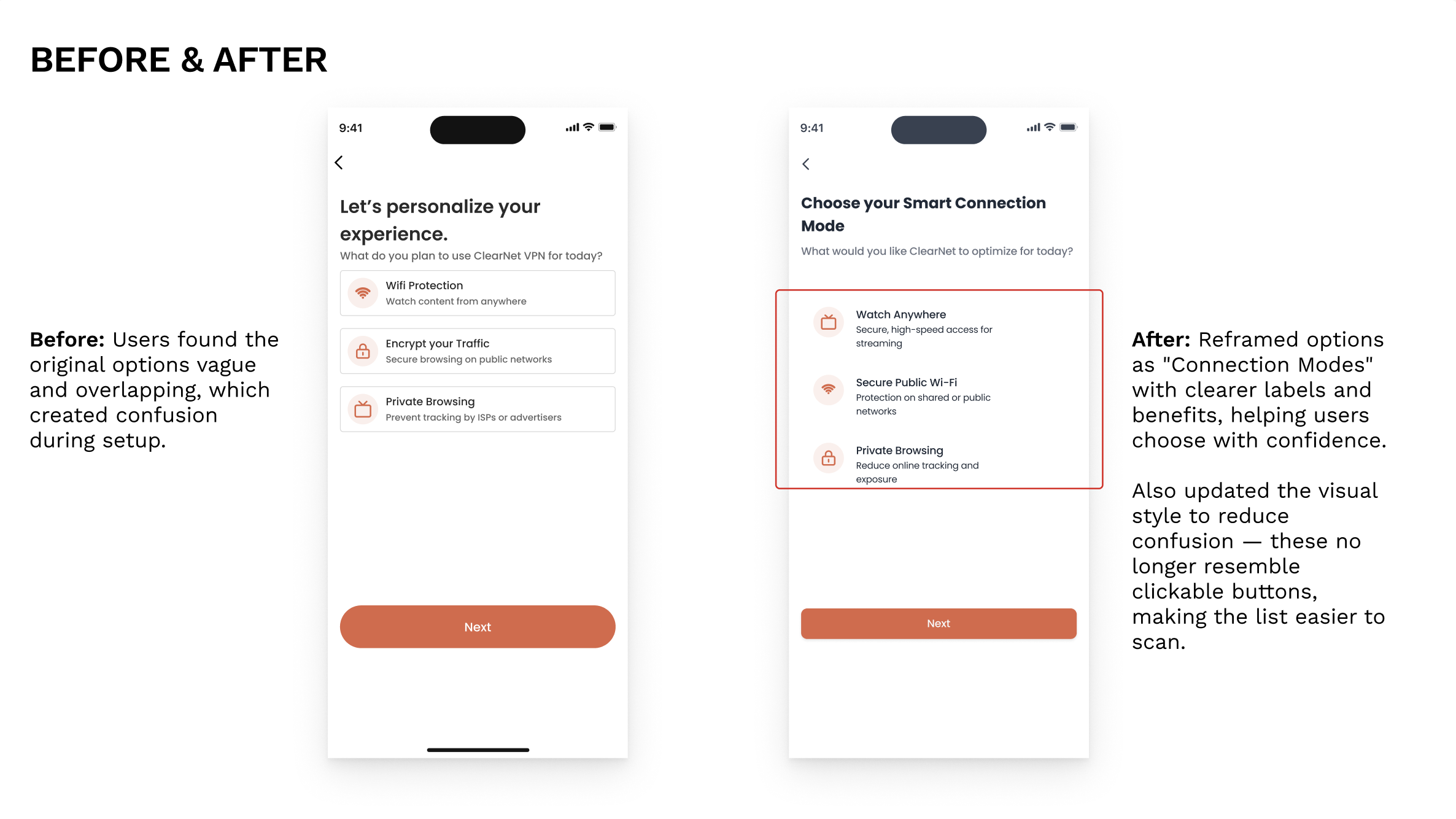
The original onboarding asked users to choose between "Wifi Protection," "Encrypt your Traffic," and "Private Browsing." Users found the options vague and overlapping — and the card components looked like static information, not choices. I reframed the options as Smart Connection Modes with outcome-focused labels: Watch Anywhere, Secure Public Wi-Fi, Private Browsing. I also updated the visual style so the options no longer resembled tappable buttons, directly addressing the affordance confusion from testing.
02 — Streaming Compatibility: Visual hierarchy that earns trust
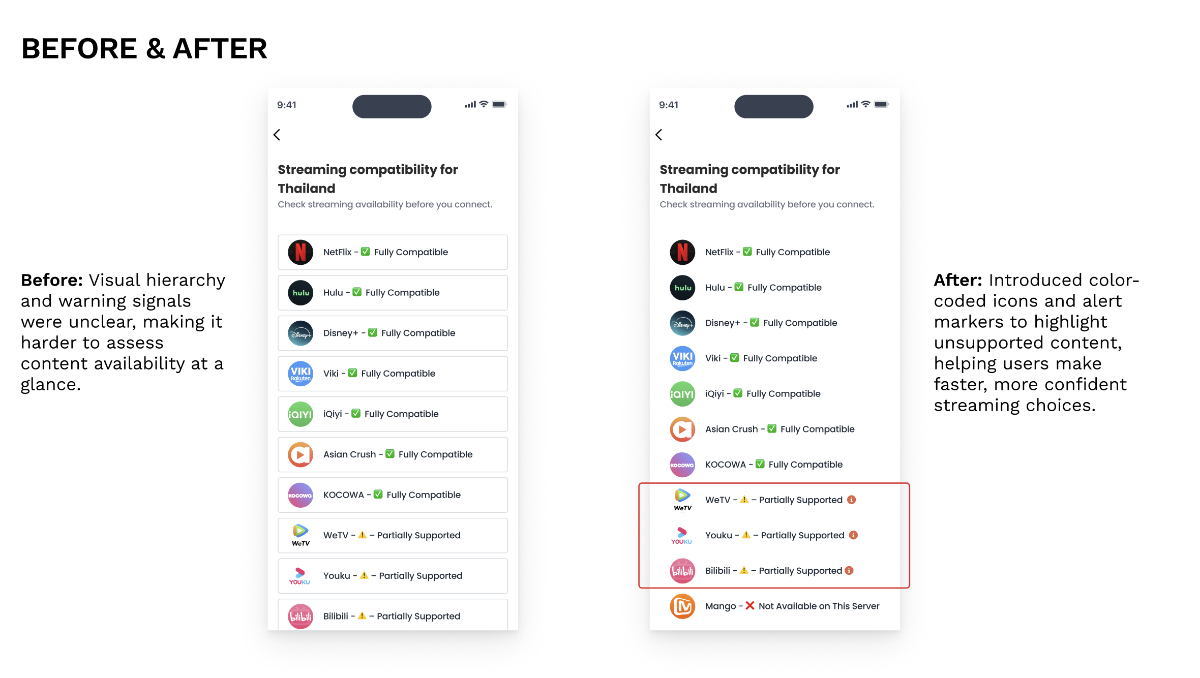
The original list treated fully compatible and partially supported services identically. Users scanning quickly missed the warnings entirely — some assumed WeTV was fully supported when it wasn't. I introduced color-coded icons and alert markers so the compatibility status was immediately readable at a glance. For users whose whole reason for using a VPN is watching WeTV or Viki, this detail matters enormously.
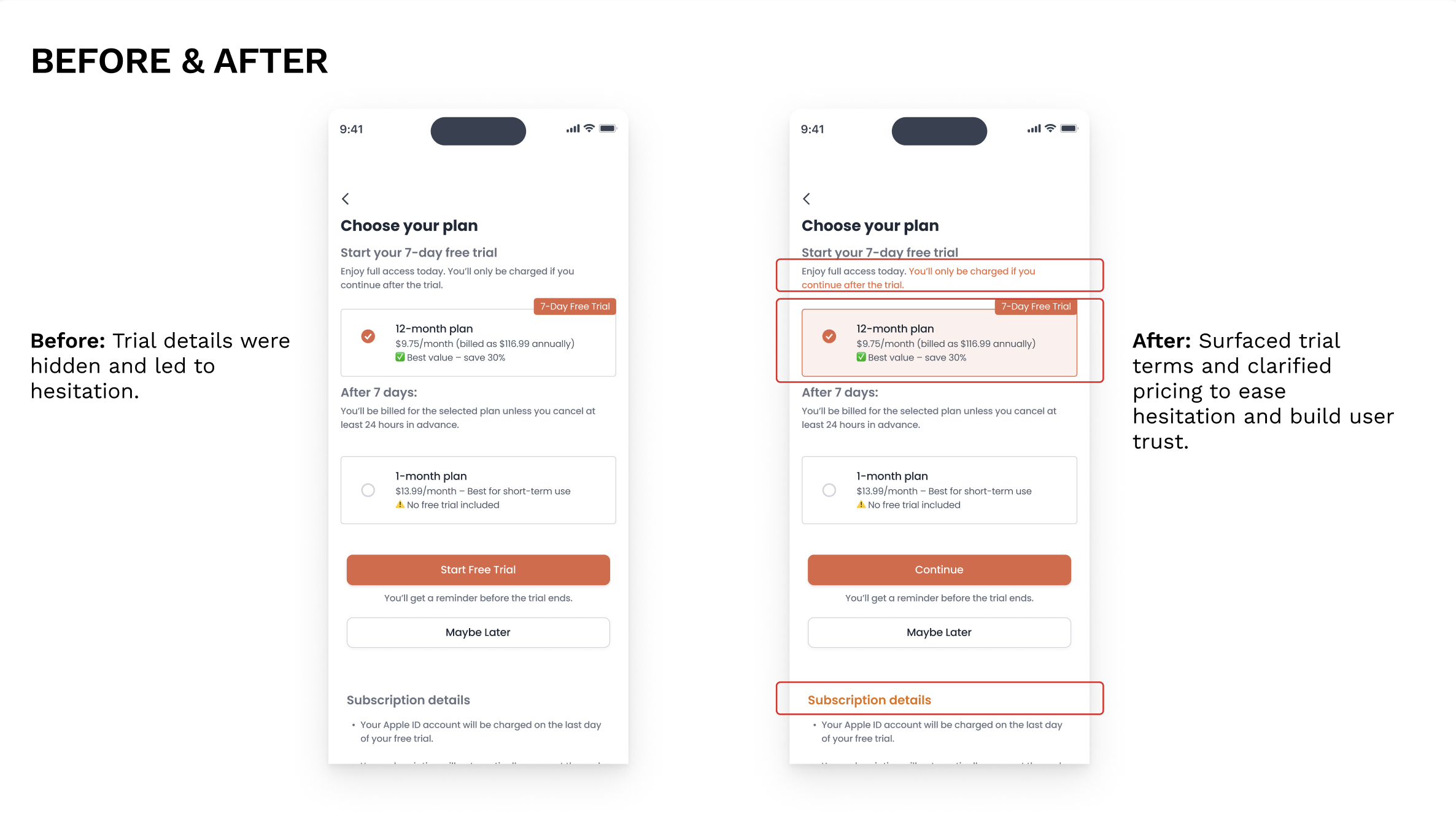
03 — Pricing Transparency: Surface what users actually need
Trial terms were technically present but visually buried. I surfaced the key message — "You'll only be charged if you continue after the trial" — at the top of the screen in highlighted text. I also added a clear warning on the monthly plan that no free trial was included. Small changes, but they directly addressed the hesitation pattern that showed up in every single testing session.

What I Learned
The biggest lesson from this project is that clarity is not the same as simplicity. I made design decisions that felt clean and obvious to me — and users consistently got stuck on them. The card component issue was the most direct example: affordance has to be communicated visually, not assumed. What looks unambiguous on a designer's screen can be completely opaque to someone encountering it for the first time.
The influencer finding also stayed with me. Users weren't looking for trust signals inside the app — they were going to YouTube first because VPN apps as a category had already failed them. That's a harder design problem than unclear UI. It means trust has to be built before the first tap, not just after.
When I presented this project, a fellow designer asked whether the AI-powered server recommendation was actually feasible to build. It was a fair question — and my honest answer was that I didn't know. But that wasn't my starting point. I started with a user who was paralyzed staring at 200 servers with no idea which one would let them watch WeTV. The design solution followed that need. Whether the AI can technically deliver on it is an engineering conversation — but you can't have that conversation until a designer has made the case for why it's worth building. That exchange helped me articulate something I'd been doing intuitively: UX research doesn't just validate designs, it makes the argument for what's worth building at all.
This project also reinforced something I was learning simultaneously at MIT: AI-assisted features only work if the surrounding experience already feels trustworthy. Intelligence without transparency just creates a different kind of confusion — and that's the next layer I want to bring into the Cube AI experience.