My Role — Designing Questy, the AI Guide
Not a corner chatbot. A guide that meets students exactly where they are.
One of the most deliberate design decisions on this project was where Questy lives in the product. Rather than tucking the chatbot into a corner widget, I designed Questy as a prominent banner presence on the home screen — the first thing a student sees after logging in. This was intentional: for a student who's overwhelmed and doesn't know where to start, Questy is the on-ramp.
I redesigned the conversation flow with three principles:
- Meet students in uncertainty — Questy doesn't assume students know what they want. It opens with exploratory questions, not gatekeeping ones.
- Use real teen language — responses were rewritten to feel current and natural, not corporate or academic
- Guide without overwhelming — Questy surfaces one next step at a time, reducing the paralysis of too many choices at once
Early Design & Wireframes
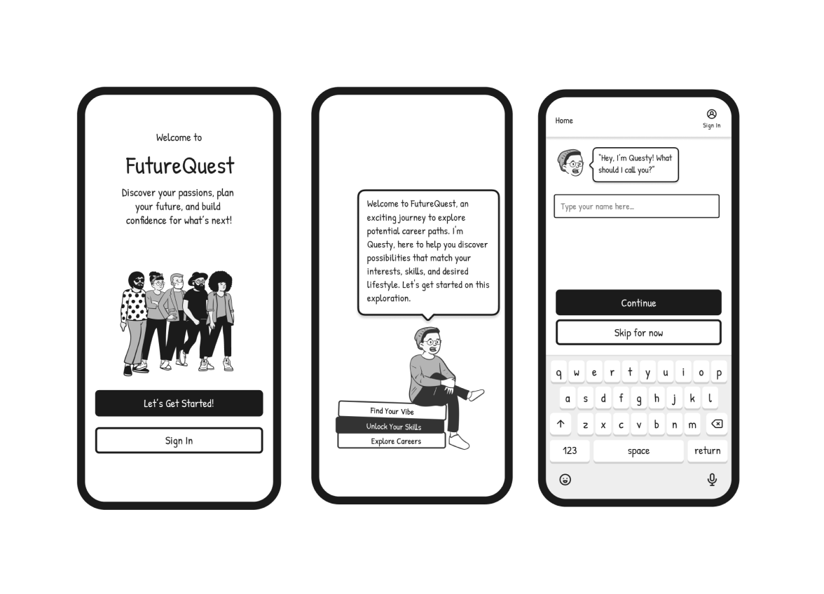
Original illustrated design language and conversation flow, developed before any prototype was built
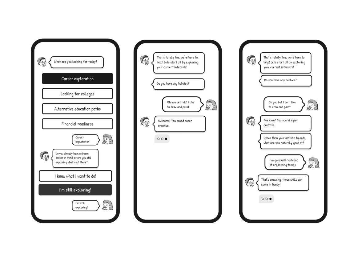
Questy's conversation design — grade selection, career interests, and hobby discovery mapped out in detail.

Questy's first working version built in Landbot — rapid no-code prototype used for Wizard of Oz testing.
Wizard of Oz Testing
Before we built the AI, we became the AI.
While one group of students tested the conversation flow with classmates in real time, I worked in parallel as an async student — observing the feedback coming in from those live sessions and bringing it back to our group meetings to discuss what wasn't working.
That parallel testing revealed something quickly: some of the questions Questy was asking weren't relevant to how teenagers actually think about their future. The language felt like a guidance counselor's intake form, not a conversation.
This is when I proposed moving from a scripted flow to an AI agent. I learned how to give the AI specific instructions — essentially teaching it a skill set — so it could respond naturally within defined boundaries rather than following a rigid branching script. Getting the AI to answer the way we wanted required careful prompt design: specifying tone, constraints, what to avoid, and how to handle unexpected inputs. It was my first deep experience with AI behavior design, and it changed how I think about the role of a designer in an AI product.
What we learned from testing:
Students wanted Questy to feel like guidance from someone who'd been through it — not a system processing inputs. The flow felt like filling out a form. Fewer choices at a time worked better than long lists. And the language needed to sound like a real teenager, not a corporate chatbot.
What changed as a result:
Every finding became a design decision — language rewritten in real teen voice, branching simplified, and Questy repositioned as the first thing a student sees when they log in.
What stuck with me:
Our professor pushed us to think about something smaller but more profound — the micro-interactions around how AI responds. A slight pause before answering. A typing indicator that slows down. Small signals that make AI feel like it's actually thinking rather than just retrieving. That feedback opened up a design question I'm still thinking about: how do you design AI behavior that builds genuine trust? Not just functional trust — but the kind of trust that makes people feel like they're talking to something that understands them.
Safety-First Design
Designing for minors taught me there are rules most designers never think about.
Early in the process, our team was excited about social features — peer-to-peer chat, community boards, connecting students with professionals in their fields. It felt like the natural way to make career exploration feel less lonely.
Then we hit a wall. Designing for users ages 14–18 means navigating a specific set of legal and ethical protocols around data collection, consent, and online interaction that most consumer product design simply doesn't have to consider. Minors can't consent to data collection on their own. Peer interaction platforms require moderation infrastructure that's incredibly difficult to get right. And the liability around anything going wrong in an unsupervised teen community is significant.
Our professor's feedback on this was one of the most valuable learning moments of the project — pushing us to think not just about what would be delightful, but what we were actually responsible for as designers building for a vulnerable user group.
What we decided:
We removed peer-to-peer chat entirely. Questy fills that social-support gap — giving students a responsive, judgment-free guide — without any of the safety and moderation risks of open peer interaction.
Access is school-verified: students log in through their school with a counselor-assigned code rather than a personal account. This protects student data while keeping the platform accessible, and it puts a trusted adult — the counselor — in the loop without making them a gatekeeper.
What I took away:
Designing for minors is a discipline in itself. It changed how I think about responsible design — not just accessibility and inclusion, but the legal, ethical, and psychological dimensions of building products for people who can't fully advocate for themselves.
The Product

Student dashboard — quests, XP, badges, and Questy prominently featured as the entry point.
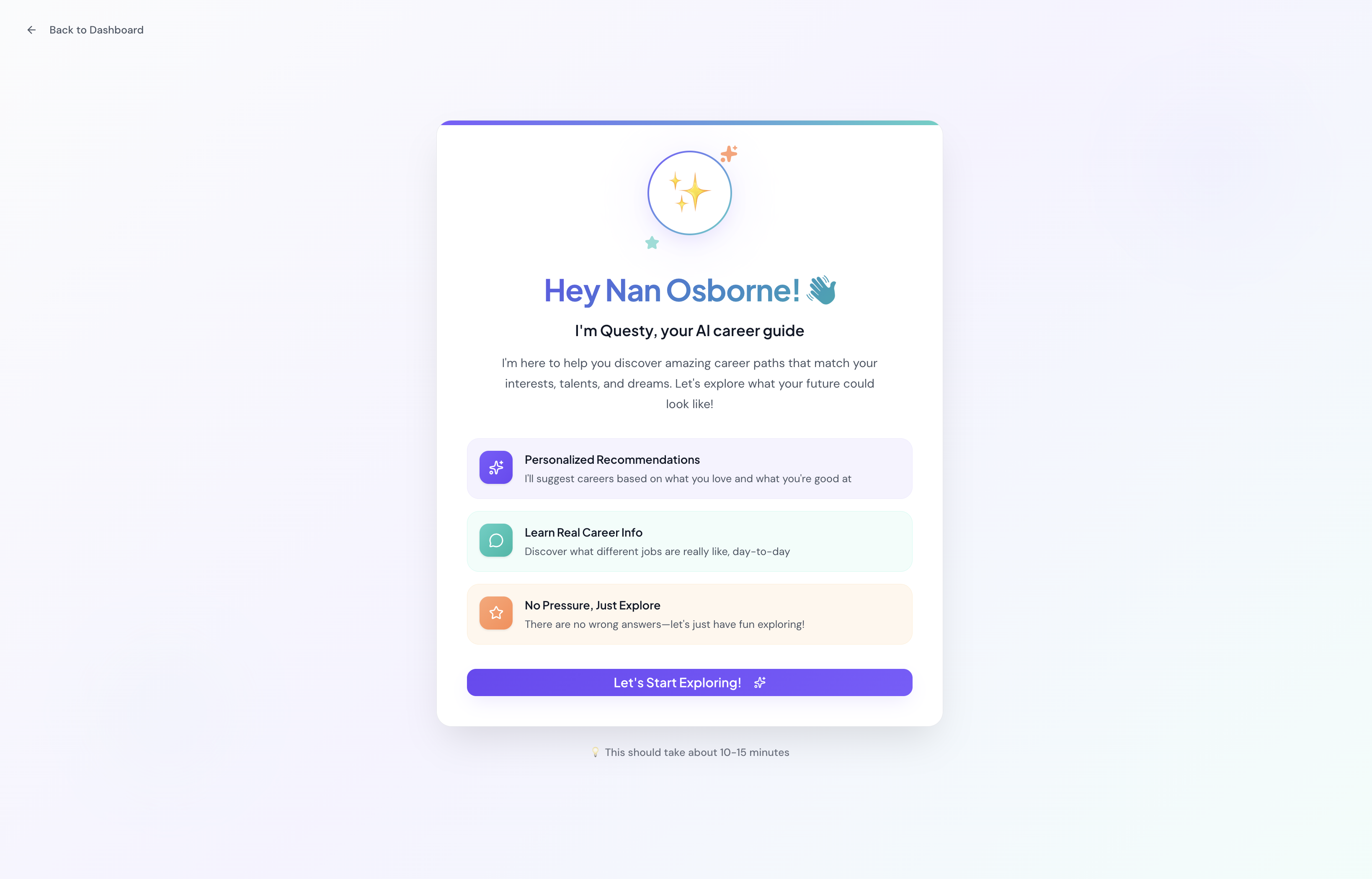
Questy welcome screen "Hey Nan Osborne 👋"Caption: "Questy's welcome screen — designed to feel like an older sibling, not a form.

Badges grid : Students earn badges as they complete quests — progress made visible and motivating.
Live Product
I built Questy as a fully functional MVP in Figma Make — a real working AI you can interact with right now. Click below to start a conversation and see the experience firsthand.

