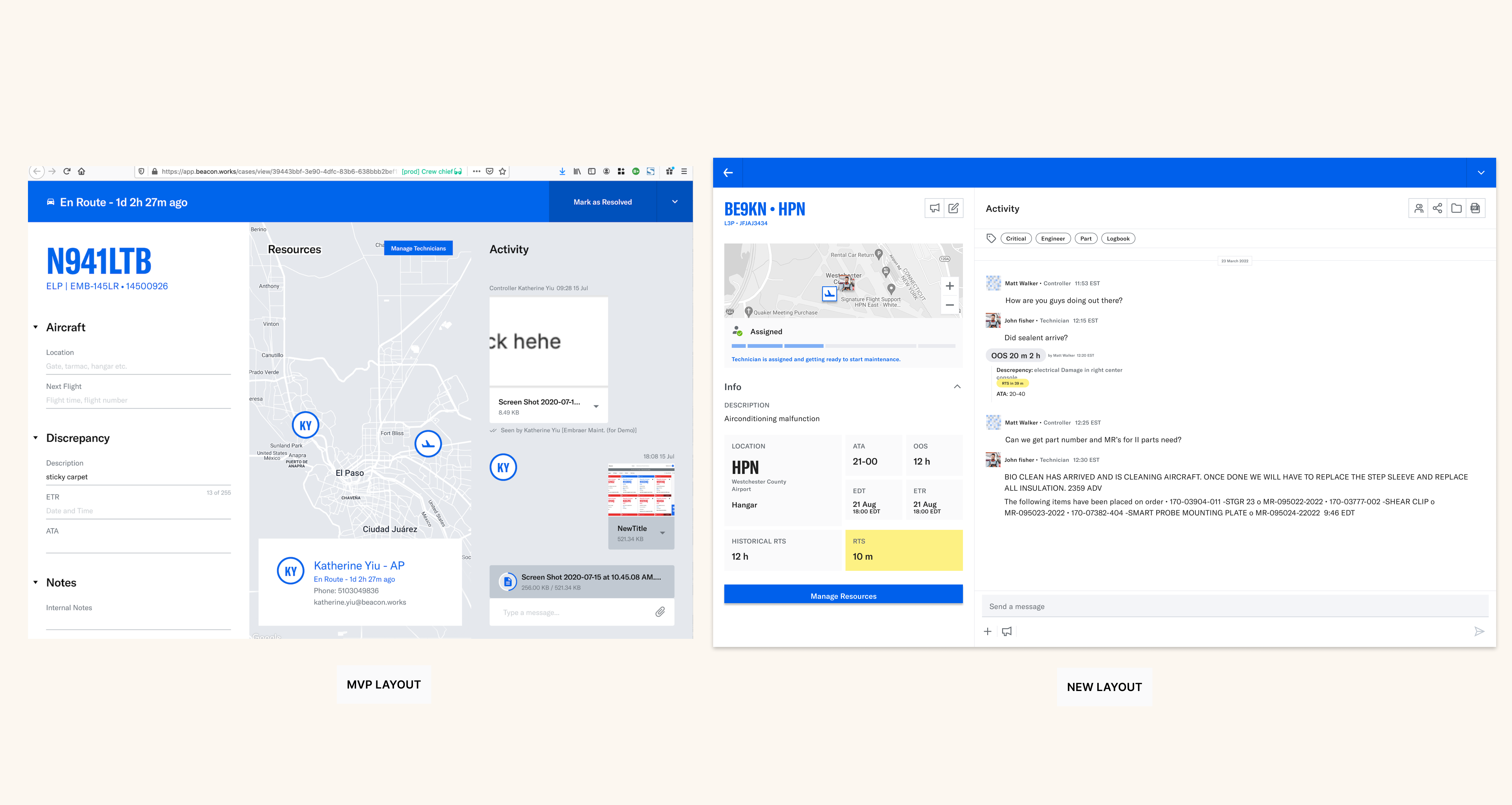
The original Case Room lacked technician visibility or qualification context.

Field Research at Republic Airways
I conducted extensive field observations and interviews at Republic Airways' Maintenance Operations Control (MOC), revealing several key insights:
- Shadowed controllers and interviewed mechanics across sites
- Analyzed chat transcripts to identify behavior patterns
- Performed contextual inquiry during active case coordination
- Documented pain points and collaboration gaps
Qualitative Research Approach
- Conducted in-depth interviews with maintenance staff across different roles
- Performed contextual inquiry during actual maintenance operations
- Analyzed communication patterns and workflow bottlenecks
- Documented system switching behaviors and pain points

Key User Feedback
Our partnership with Republic Airways revealed a crucial insight: as an airline with an in-house maintenance team, their workflow differed significantly from our MVP assumptions. This prompted a reevaluation of our approach.
"What does the map really do? It's taking up a lot of space in the UI."
"We could use this space to focus on what's actually happening in the case."
Design Decisions
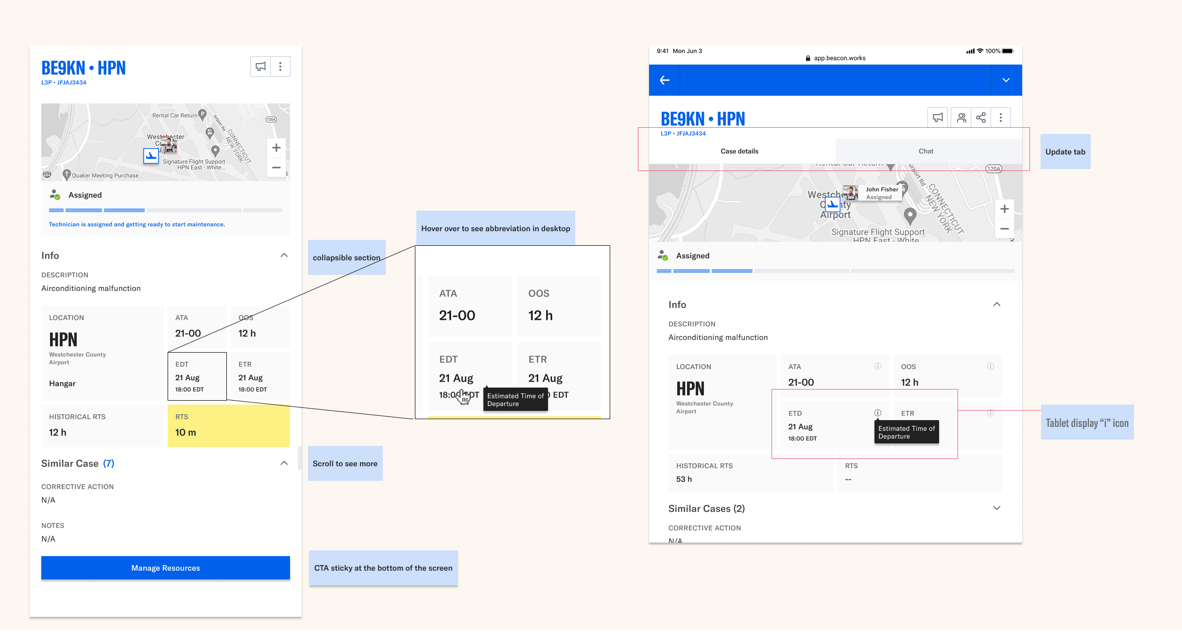
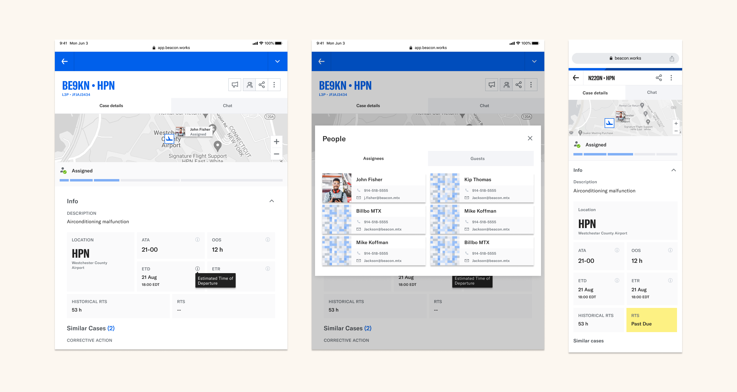
Collapsible Case Info Panel
Designed collapsible modules to reduce cognitive load.
- Prioritized info: status, location, ATA/OOS time
- Enabled deeper drill-down when needed
Modular design enables quick scan and deeper dive.
Mechanic Card System
Created mechanic cards with contextual info.
- Included contact, work history, and map avatars
- Designed fallback with initials when photos were missing
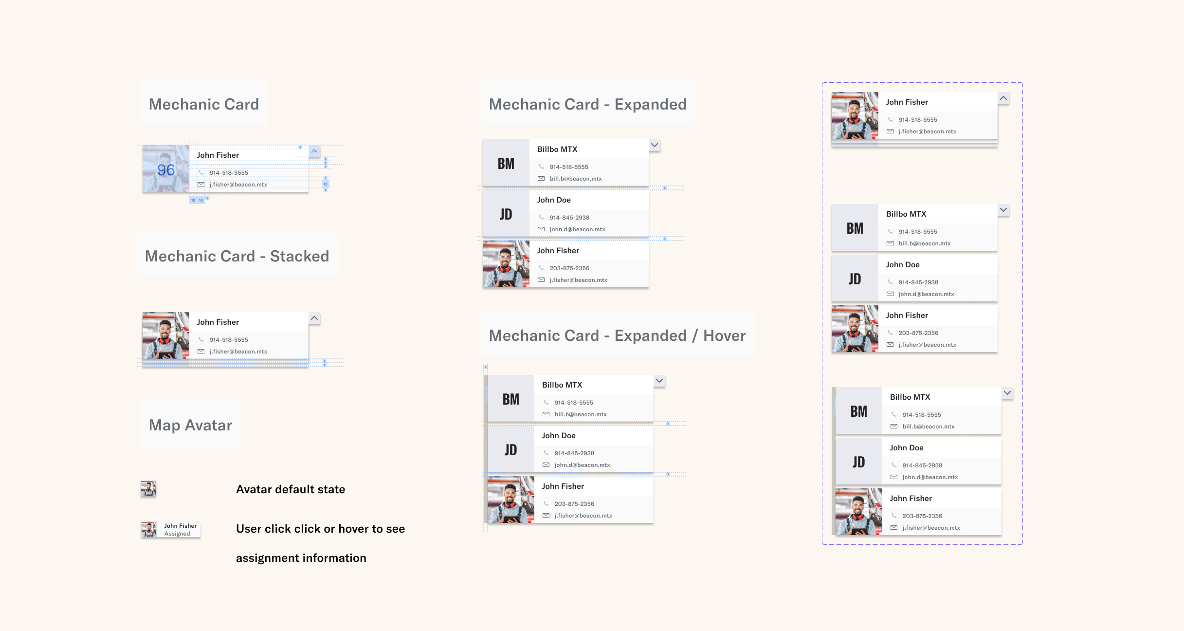
Surface just enough context to assign with confidence.
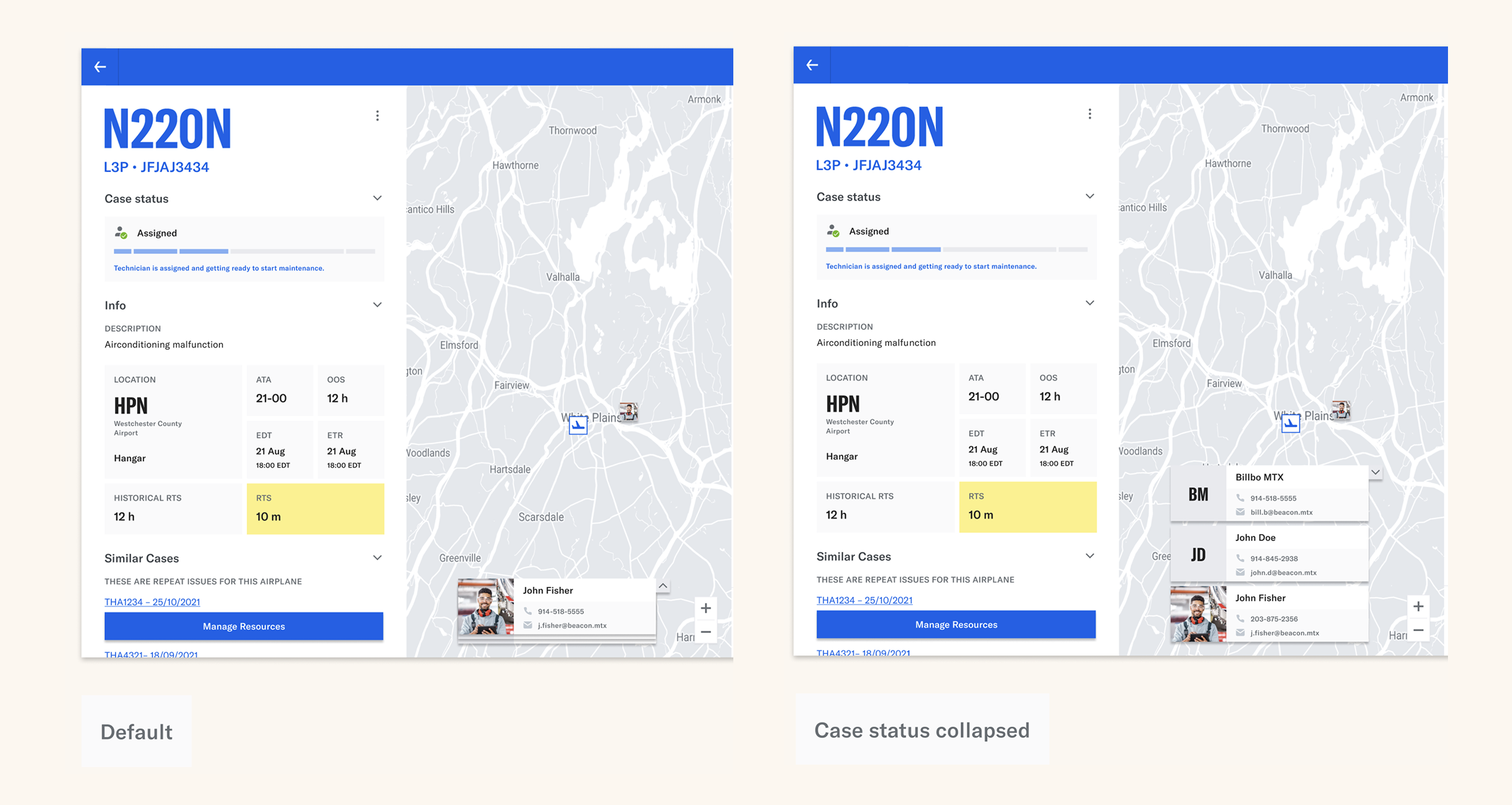
Map Rebalancing + IA Overhaul
Reduced map dominance without losing orientation cues.
- Transitioned to a 3-column layout
- Made Chat + Case Info always visible
Preserved the map's role while reducing its dominance
Responsive Design for Field Use
Optimized layout for on-field tablet use.
- Touch target audit for accessibility
- Mobile views for assigned, resolved, closed cases
Brought full case context to crews in the field.
Outcomes
- 🚀 30% faster technician assignment
- ⏱️ 20% reduction in task turnaround time
- 🛫 Improved compliance visibility
- 🌍 Adopted by 6 international MRO teams

The redesign delivered impact across speed, safety, and scale
What's Next
- Smart filters + tags for chat
- Extend mechanic qualification tooling
- Explore broader people analytics to proactively surface qualified personnel — see People Analytics Case Study →
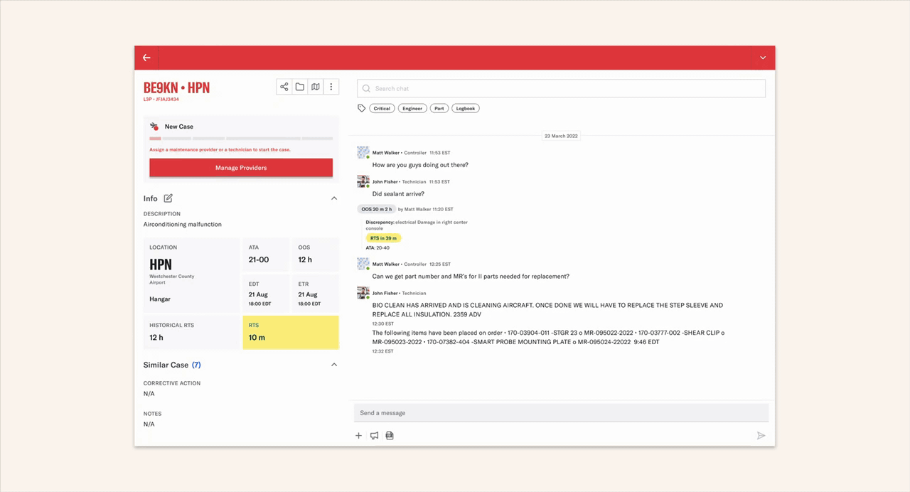
The final design completely restructured case visibility and de-emphasized the map by hiding it in a full-screen modal.
Constraints like "no profile photos" led to better fallback UX
Clear Information Architecture had a greater impact than visual trends
Working closely with stakeholders through research accelerated adoption and alignment
Strategic Impact: UX decisions can influence broader product strategy